PSUK Conference
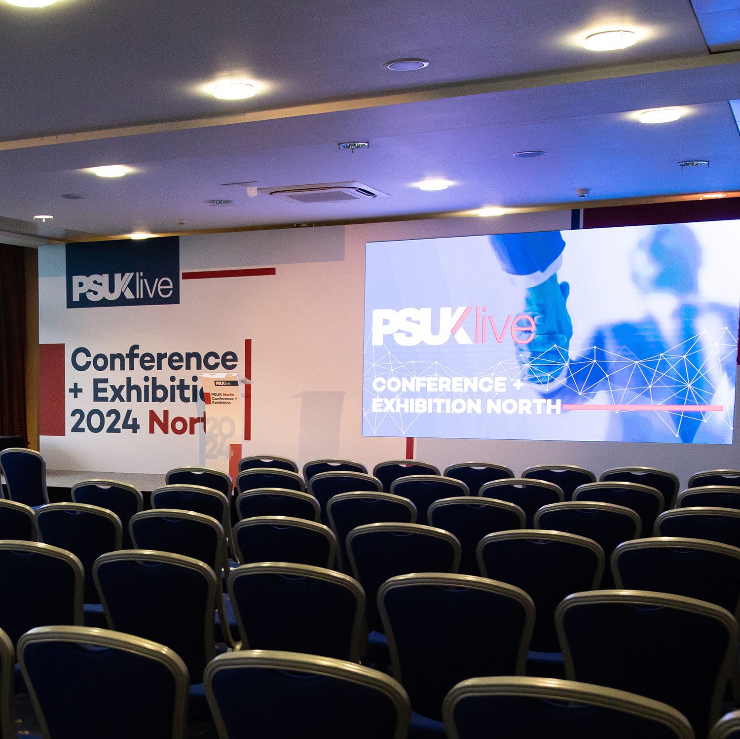
PSUK required a new visual identity system to refresh both the brand and its biannual national conferences. The existing logo was retained, but a new design style was needed to modernise the brand and create a consistent look across all future materials. The conferences take place twice a year across the north and south of England, inviting over 900 members nationally.
Brand Refresh, Event Branding, Design System, Campaign
2024
Challenge
The existing PSUK visual style had become dated and visually flat, no longer reflecting the professionalism and energy of the organisation. The challenge was to create a modern, credible design system that worked across multiple conference locations, aligned with the existing brand, and could scale across future events, all under tight production deadlines.
Role
As Senior Graphic Designer, I owned the visual direction and design system for the rebrand. I led the creative process from concept through to rollout, defining the new style and implementing it across conference materials. I worked closely with marketing and the Head of Events to translate strategic objectives into a scalable visual framework.
Approach
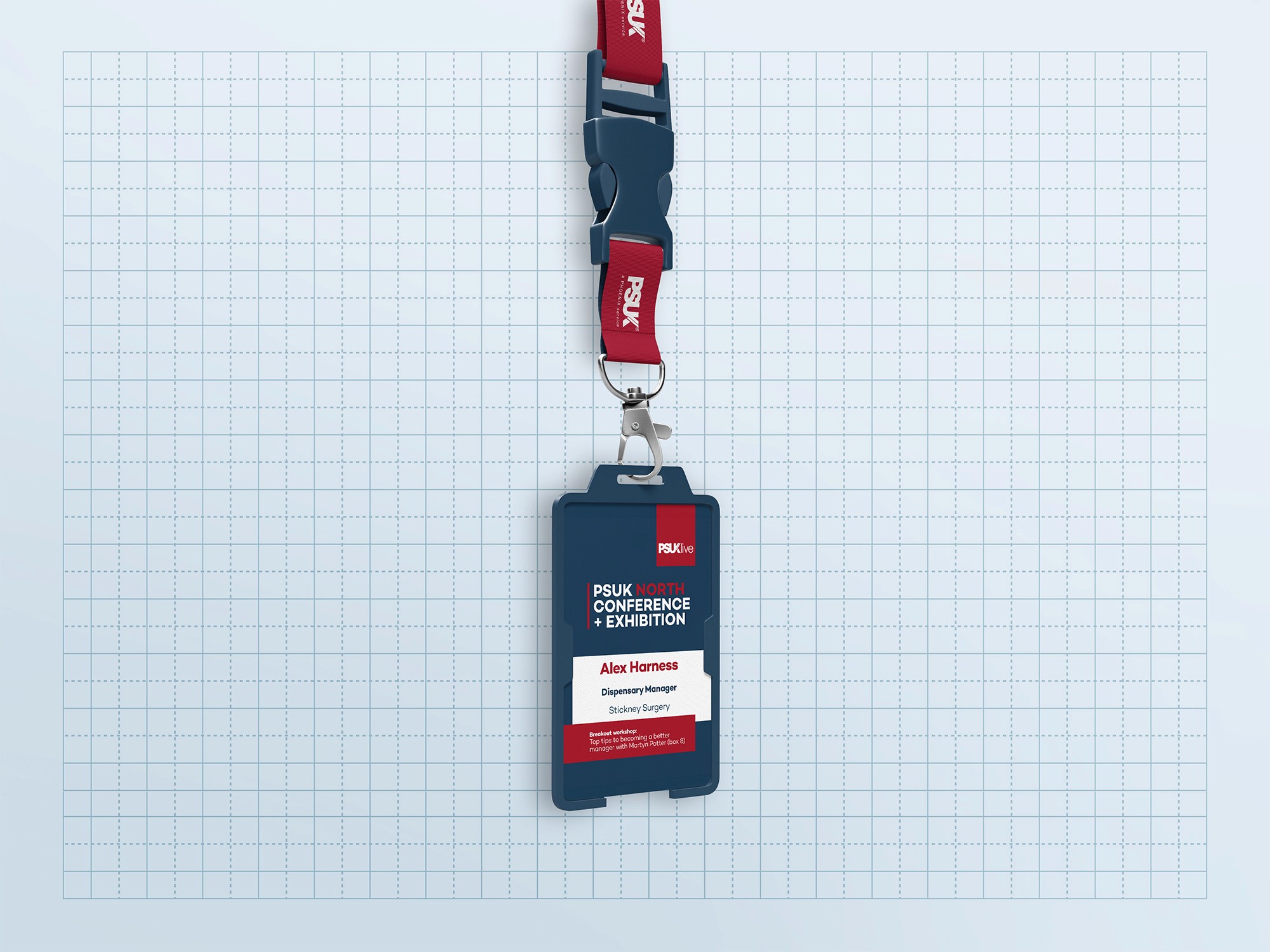
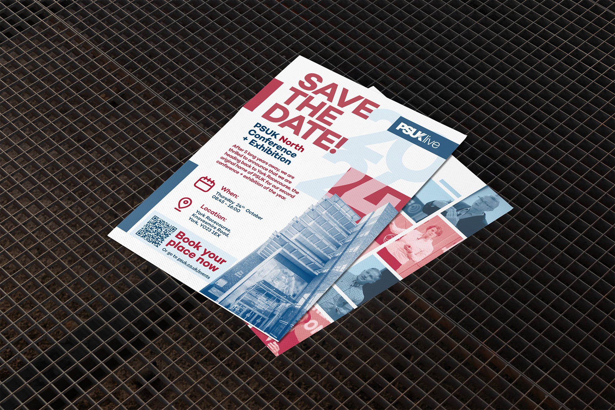
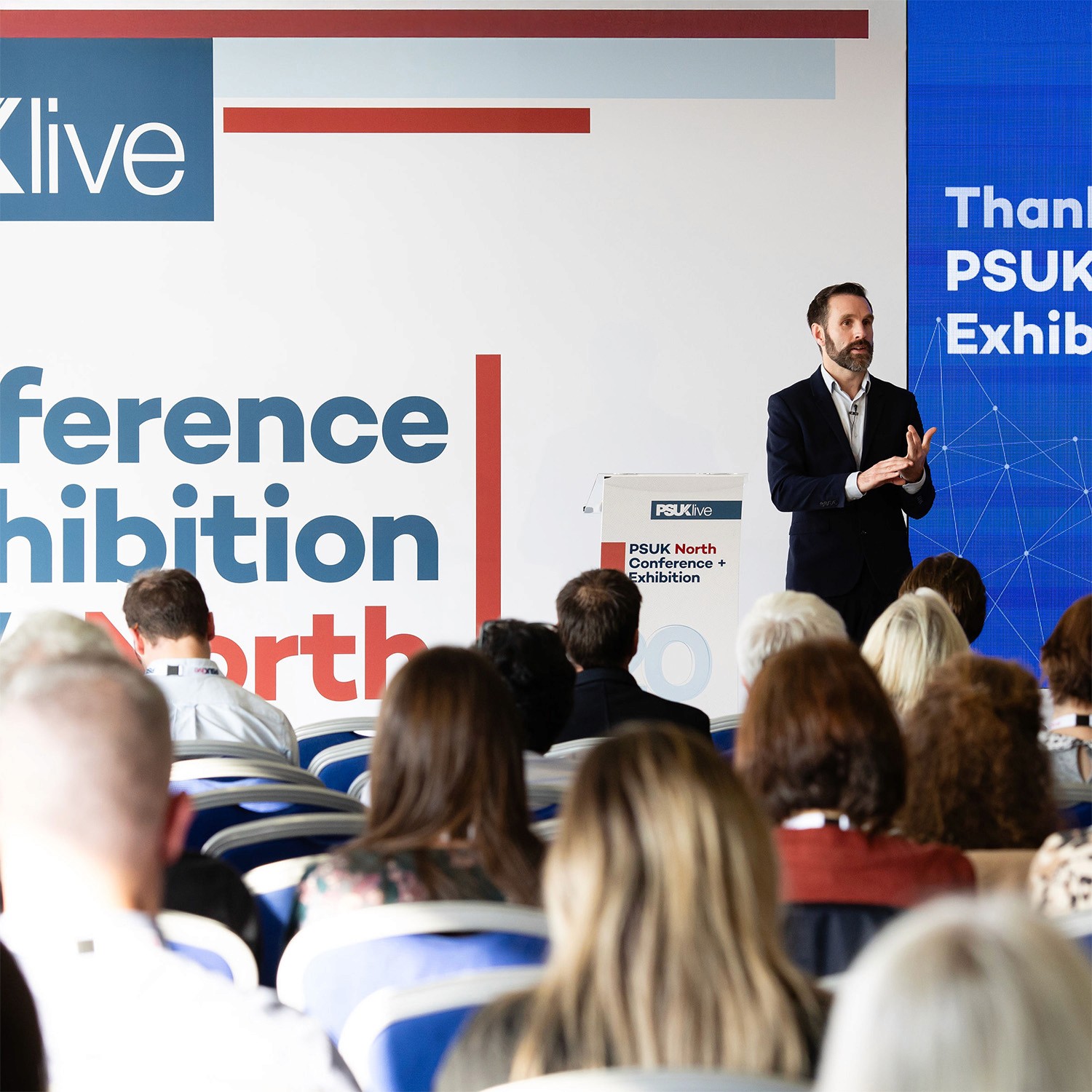
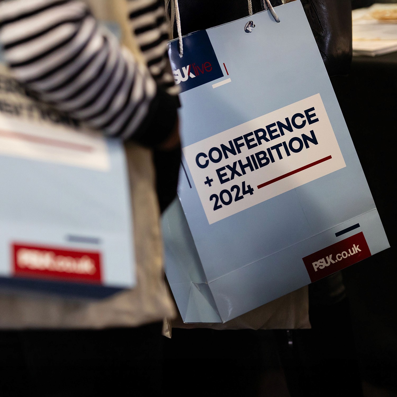
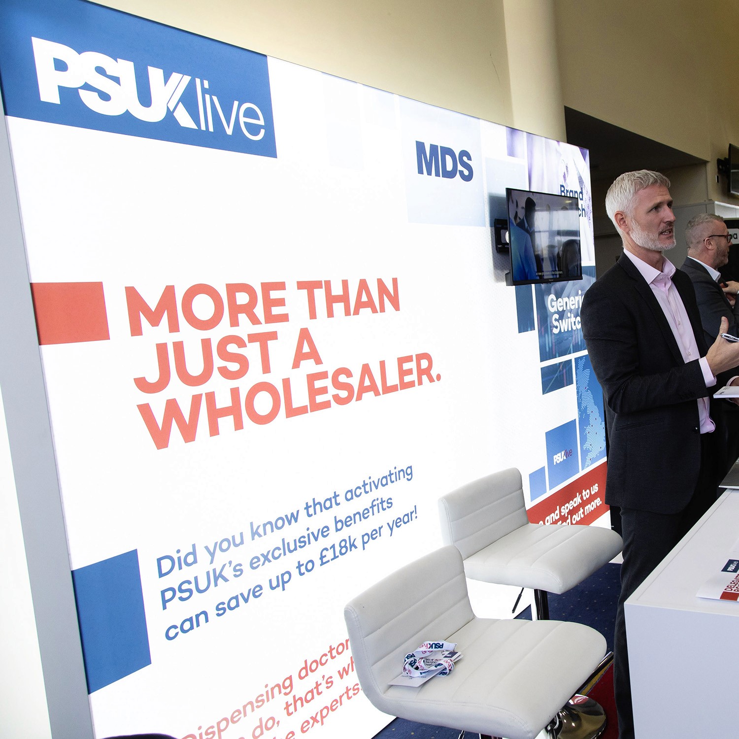
The design moved away from generic conference templates, instead focusing on people and place by highlighting speakers, venues, and the event experience. A grounded, sketchpad-inspired visual language was paired with real conference imagery to create a more authentic, energetic, and modern look. Early flyer concepts established the direction, which was then rolled out across the full conference system.
Outcome
The new design system modernised the PSUK brand and created a flexible identity used across both national conferences and future events. The framework was adopted as the standard for PSUK communications, received strong stakeholder feedback, and established a scalable foundation for ongoing brand activity.